3, typical case of food packaging design
The following is a case study of packaging design from two different perspectives. We hope that our packaging design concepts and methods can be used as reference for corporate packaging design.
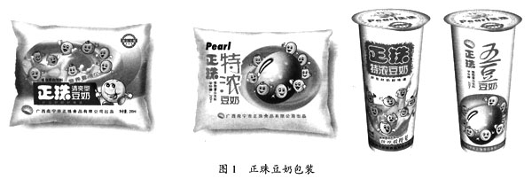
3.1 Zheng Zhu Soymilk product image design case: vividly express “nutrition concept†in a rational and inductive way
Nutrition is one of the main motives for soymilk consumption. People understand that soymilk is nutritious, but when it comes to what nutritious soymilk is, the vast majority of people may only know about protein, and other high levels have an important role in human health. Nutrients such as isoflavones, lecithin, vitamin E, iron, saponins, calcium, bifidogenic factors, etc. are often not known by ordinary people. The nutritional value of soymilk is also reduced to the concept of a protein-based product stored in the human brain. In this case, Zhengzhu is required to propose a new product concept for the nutritional appeal of soymilk in order to create a new Zhuodong soymilk Product image.
Nutrition is present in the food in the form of particles or elements. Although it is good for people's health, it is something we cannot see. Nutritional impressions are often abstract and non-vital texts. The “nutrition-visible†appeal strategy we proposed for Zheng Zhu Soymilk is to amplify the details of products that are easily overlooked by people, so as to create a dramatic effect. It is the product feature of “the most comprehensive nutritional soy milkâ€.
The vivid expression of nutrition in the form of cartoons is both lively and has good affinity. It is very suitable for the characteristics of soymilk products. Therefore, we designed 8 kinds of nutrients into 8 small cartoons to express the characteristics of the products. The nutrients expressed in the form of cartoons appear on the packaging, making “nutrition visible†a dramatic realization, as shown in Figure 1. The cartoon performance method is in line with the aesthetic requirements of our target consumer groups (adolescents and children), and through the promotion of soymilk nutrition, we meet the food requirements of another target consumer group (parents of children and adolescents).
3.2 Jincai Milk Packaging Design Case: Leveraging themes to carry the cultural value of the millennium
“Jin Cai†is the Changchun milk brand and it is an established company with a history of seven years. After analyzing the brand name, we believe that the name “Golden Fortune†does not seem appropriate as a dairy brand, because “Golden Fortune†makes it easy for people to first think of things like gold and silver treasures. Dairy products, such as emerging consumer health products, are a bit out of place.
In response to this problem, we launched a design. We first thought of the image of “God of Wealth†from “Fortuneâ€, so we designed a cute little God of Wealth. In-depth understanding, found that since ancient times, there are mounts of the God of Wealth. So we let the cute little God of Wealth ride on a cow. This way, “Golden Fortune†is linked to the dairy product visually, and it is used by us as a main visual image for various applications. On this basis, we also created "Heavenly Wealth Little God of Wealth," "Ruyi Little Fortune God," and "Healthy Little God of Wealth."
On the theme of packaging design, "health is the source of wealth" to explain the value of products and brands, and its specific description is to "quality like gold, health seems to be wealthy" as the main advertising language to spread.
When the entire project was completed, the client's evaluation was: not only regained the brand assets that Golden Fortune had painstakingly accumulated over the past seven years, but also unexpectedly obtained a wealth of cultural heritage, which has a history of thousands of years.
F&M Food and Machinery